Erik Pukinskis / Portfolio
👋 Hi! I am an experienced software developer and engineering leader, with a focus on crafting great user experiences. I am passionate about predictable delivery, developer experience, design systems, technical debt, and making work fun.
I am currently based in the San Francisco Bay Area and interviewing for remote or hybrid positions 2-3 days a week in SF. I am open to IC or Engineering Manager positions.
Latest from my blog:
How to "own" a project if you're an engineer (Jan 2025)- Download my Resume
- Get in touch via email or LinkedIn
- Read my dev blog
- Browse my open source contributions on Github
- Code snippets on CodePen
Kernel
Kernel needed a powerful UI for organizing transcript annotations. I built an AI powered annotation tool integrating ChatGPT, as well as a rich document editor using Draft.js for manual annotation. I also built and open sourced a high performance drag-n-drop React tree component for organizing annotations.
Spaero Bio
I joined Spaero as a contractor to build the component library on which their 1.0 product would be based. Built in React and Radix, I created a wide range of components, from checkboxes and sliders to a drag-and-drop "deck" editor.
Globality
Globality's design team had the foundations of a great design system, encoding careful decisions about space, color, type, etc. For a new feature they wanted to expand the design system to include robust tooling and guidance for creating a variety of data visualizations.
I worked hand-in-hand with designers to build and refine a set of primitives using React and Visx, including:
- Design tokens for sequential and categorical colors
- Typography
- Tooltips
- Responsive axes and bars
- Chart filter components
Dive in to the details on the Globality Blog
Shortcut
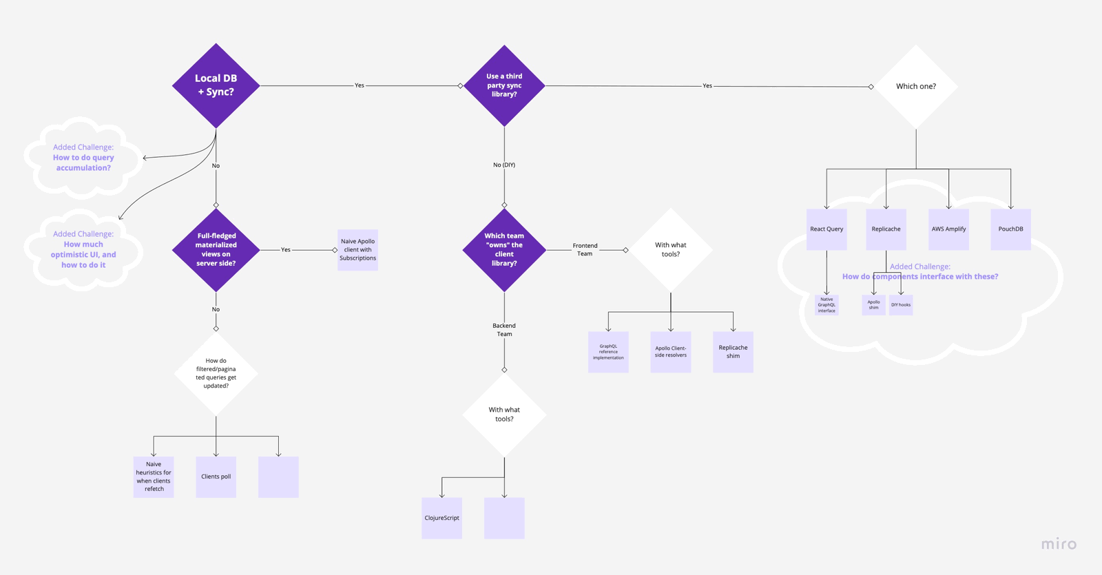
Shortcut wanted to transition from a legacy SPA built on bespoke templating and MVC tools to a new, modern data layer. While Apollo and GraphQL are powerful tools that solve many problems, many issues from pagination to optimistic UI, multiplayer synchronization, and query aggregation are extremely tricky to design into an architecture. I helped drive conversations across teams and disciplines so that we could search a big requirements and solution space for the architecture and tools that would meet our needs long term.
Pathpoint
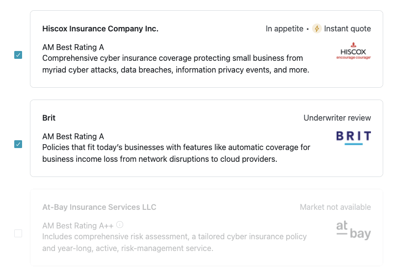
Pathpoint was a young company with a modern technical foundation, but a codebase lacking in discipline. While delivering features at a breakneck pace I helped refine best practices from GraphQL and TypeScript to Storybook and CSS. I dramatically simplified our component library, getting close to the holy grail of pages built entirely from Design System components.
Good Eggs
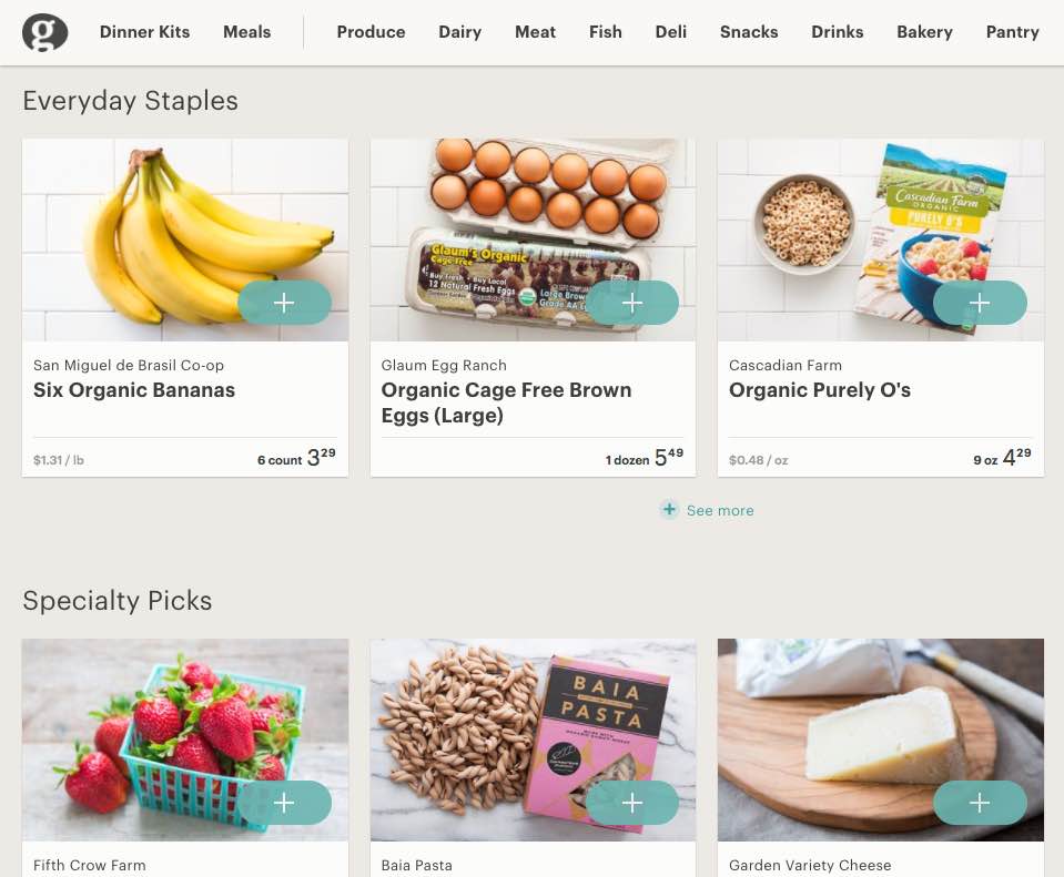
Good Eggs was a rapidly evolving grocery delivery service. My focus there was taking multiple different in progress front end architectures and and moving them towards a more unified codebase, as well as working with designers to move towards reusable components, rather than a large volume of one-off visual styles.
SproutRobot
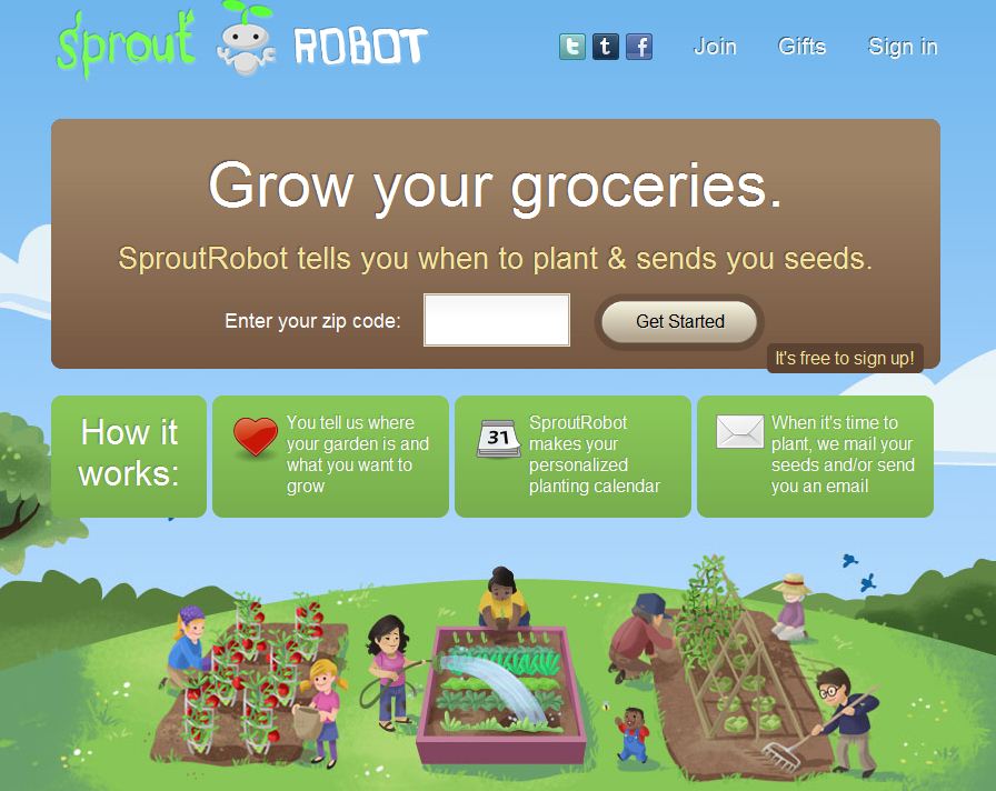
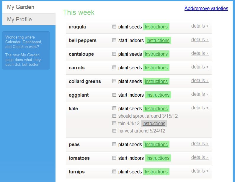
SproutRobot was a startup I founded, and a Ruby on Rails app I built. The site helped people plan a garden, sent personalized planting calendar emails, generated custom instructional images. Extensive design research and user testing was done to ensure that beginners could be successful in the garden.


